
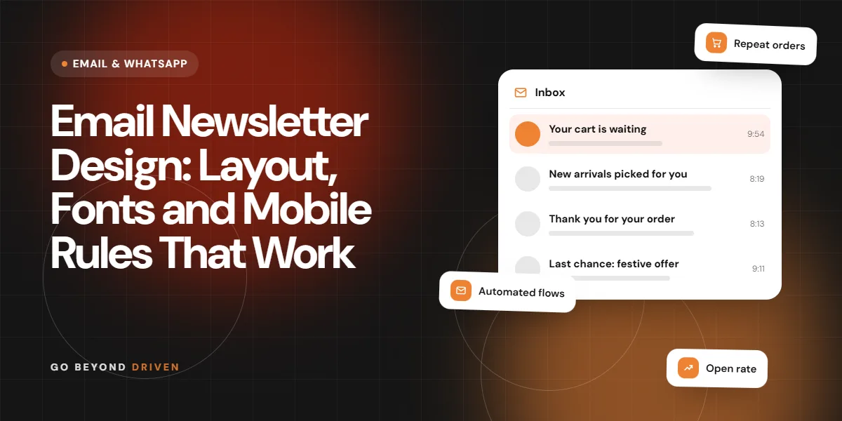
Email newsletter design is the way you arrange text, images, buttons and spacing so that a newsletter is easy to read and act on in an inbox. The safest approach is a single column layout around 600 pixels wide, a readable font size, a short header, one main call to action and images that still make sense when they do not load. Most newsletters in India are opened on phones, often between tasks or on a commute, so the design must work at a glance. This guide covers layout, typography, images, buttons, dark mode and testing, with practical rules you can apply in any email tool.
What makes a good email newsletter design?
A good design makes the next step obvious. A reader should see who the email is from, what it is about and what to do within a few seconds. That means a clear header, a strong first line, generous spacing, short paragraphs and one primary button. Decoration comes last. A useful habit is to squint at the email, or view it from arm's length on your phone: the headline, the main image and the button should still be the three things you notice.
Remember that email is not a website. Mail apps strip styles, block images and render code differently. A design that relies on complex layouts or background images will break somewhere. Plan for the simplest version first, then add polish that fails gracefully.
What layout and width should an email newsletter use?
Use a single column layout about 600 pixels wide on desktop that stacks neatly on small screens. Many email designers keep the width between 560 and 640 pixels because it fits preview panes and scales down cleanly. Multi column layouts can work for product grids, but they need testing and should collapse into one column on phones.
Put the most important content high up. A common structure is a short header with logo, a headline or opening paragraph, the main story with one image, a button, then one or two secondary items and a footer. Avoid stuffing five stories with equal weight, because equal weight means nothing stands out. If you have a lot to say, link out to the full article on your website and keep the email to a teaser, a benefit and a button for each item.
A reliable newsletter structure:
Which fonts and text sizes are safest?
Use web safe fonts such as Arial, Georgia, Verdana or Tahoma as fallbacks, even if you choose a custom brand font for supporting mail apps. Many inboxes ignore custom fonts, so your design must look good in the fallback. Keep body text around 16 pixels on mobile, with a line height near 1.5, and headlines clearly larger.
Left align body text, because centred paragraphs are harder to read. Keep lines short, use bold sparingly and choose strong contrast between text and background. If your audience reads Hindi or Marathi, test how those scripts render, since font support varies between devices and mail apps.
How should you use images in a newsletter?
Use images to support the message, not carry it. Some inboxes block images by default, so never put key information, such as an offer date or price, only inside a graphic. Add descriptive alt text so something useful shows when images are off, and size images at roughly twice their display width so they look sharp on high resolution phone screens.
Compress files so the email loads quickly on mobile data. A heavy newsletter with many large images may be clipped by some providers. Keep total image weight modest, use JPG for photos and PNG for logos and simple graphics, and test the email with images off to see what readers might see first.
How do you design a button that gets clicked?
A button should look like a button and say what happens next. Use a solid colour that contrasts with the background, generous padding, and action text such as 'Read the guide', 'Book a slot' or 'See the menu'. Avoid vague labels like 'Click here'. Make the tap area at least about 44 pixels tall so thumbs can hit it without zooming.
Build buttons with live text and a coloured background rather than a single image, so they still appear when images are blocked. Repeat the same link in a text line for people who skip buttons. One primary action per email usually outperforms several competing options, particularly on a small screen.
Button checklist:
Should you design for dark mode?
Yes, at least lightly. Many mail apps offer dark mode and may invert or adjust colours automatically, which can turn a white logo box into a visible rectangle or make dark text vanish. Use transparent PNG logos with a thin outline or a version that works on both light and dark backgrounds, and avoid pure white boxes behind images where possible.
Test your newsletter in a few dark mode environments rather than assuming. Choose text and background colours with strong contrast in both modes. If your tool supports it, add dark mode friendly styles, but treat them as an enhancement, since support differs between apps.
How do you make a newsletter accessible?
Accessible design helps everyone. Use real headings and text rather than text baked into images, provide alt text, keep colour contrast high, avoid relying on colour alone to show meaning, and write link text that makes sense out of context. Keep the language plain and the structure predictable.
Use a clear reading order, so screen readers move through the content logically, and avoid tables that exist only for layout without proper role attributes if your tool allows control of this. Accessible design usually improves clarity and click rates as well, because it forces you to simplify. It also protects you when a reader is on a slow connection, a small screen or in bright sunlight on a Mumbai train platform.
FAQs: How do you make a newsletter accessible?
How long should alt text be?
Keep it short, usually under about 100 characters, and describe what matters about the image. If the image is purely decorative, leave alt text empty so screen readers skip it.
Does a larger font help?
Yes. Body text of around 16 pixels on mobile is a widely used baseline, because it avoids pinching and zooming. Test with real readers, especially if your audience includes older customers.
How do you test a newsletter before sending?
Send a test to your own accounts on Gmail, Outlook, Apple Mail and a phone, in both light and dark mode, with images on and off. Check that links go to the right pages, the unsubscribe link works, the preview text reads well and the layout does not break. Ask a colleague who did not build it to try finding the main action in five seconds.
Keep a reusable template so each issue starts from a tested design instead of a blank page. Track what works in your email tool, such as clicks per link, and refine the template over time. For ideas on what to put inside the design, see our guide on newsletter content ideas, and read how email deliverability works so good design actually reaches the inbox.
When should you hire help with email design?
If your newsletters look different every month, break on some phones or never produce clicks, a tested template and clear structure will usually fix it. Help is also worth it when you want branding, copywriting, segmentation and automation to work together, rather than just a prettier email.
Go Beyond Driven designs responsive email templates, writes the copy and manages sending for Mumbai and Indian brands. We test every template on common phones and mail apps, build in clear tracking and hand over a reusable layout your own team can edit. Read about our email marketing agency services to see how we plan newsletters, automation and reporting.
Final thoughts
Strong email newsletter design is mostly discipline: one column, readable text, light images, one button and thorough testing. Start with a template you can reuse, then improve it with real click data. If you would like feedback on your current newsletter or email programme, book a free marketing audit with Go Beyond Driven, call +91 91378 79539 or email gobeyonddriven@gmail.com.