
Mobile first web design is the practice of designing and building the phone version of a website first, then adding space and features for tablets and desktops. It matters in India because a large share of visitors reach business sites on mid-range Android phones over variable mobile data, often while commuting, and Google mainly uses the mobile version of a page for indexing and ranking. A site that merely shrinks a desktop layout feels cramped and slow. A genuinely mobile first site puts the one action a visitor wants, whether that is calling, messaging on WhatsApp or booking, within thumb reach. This guide explains how to get there.
What is the difference between mobile first and responsive design?
Responsive design means a layout adjusts to the screen width. Mobile first is a design order: you start with the smallest screen, decide what is essential, and only then add extras as space allows. A site can be responsive and still be desktop first, which usually shows up as huge images, tiny text links and menus that were squeezed rather than rethought.
Working mobile first forces useful discipline. If a page has room for only one heading, one image and one button, you must decide which ones. That clarity then carries over to the desktop version, which tends to feel cleaner as a result.
Why does mobile first matter for Indian businesses?
Many customers in Mumbai and across India search, compare and enquire on a phone, often in short bursts on a train, in a queue or between meetings. They tap a Google result, judge the page in a few seconds and either call, message or leave. For local services, restaurants, clinics and shops, the mobile experience is the main experience.
There is also a search reason. Google predominantly crawls and indexes the mobile version of your pages, so content hidden or missing on mobile can be missing from search. If you want the technical background, our technical SEO checklist covers how mobile fits into crawling and indexing.
What are the core principles of mobile first design?
Prioritise content: lead with the answer, the offer and the next step, and push secondary detail lower. Keep one clear primary action per screen. Use a single column, readable body text and generous spacing so nothing feels crowded. Make sure every image and block earns its place, because every extra element costs load time on a slow connection.
Design for touch, not a mouse pointer. Buttons need room around them, hover effects should never hide important information, and forms should use the right keyboard type for each field. Test with real fingers on a real phone, not only in a desktop browser's device preview.
Keep the first screen honest. Visitors who land from a Google ad or a Maps listing want proof they are in the right place, so show the service, the area you cover and a way to contact you before any large banner or slider. Skip auto-playing carousels, which waste data, and use a single strong image instead.
Mobile first basics to apply on every page:
How should navigation work on a phone?
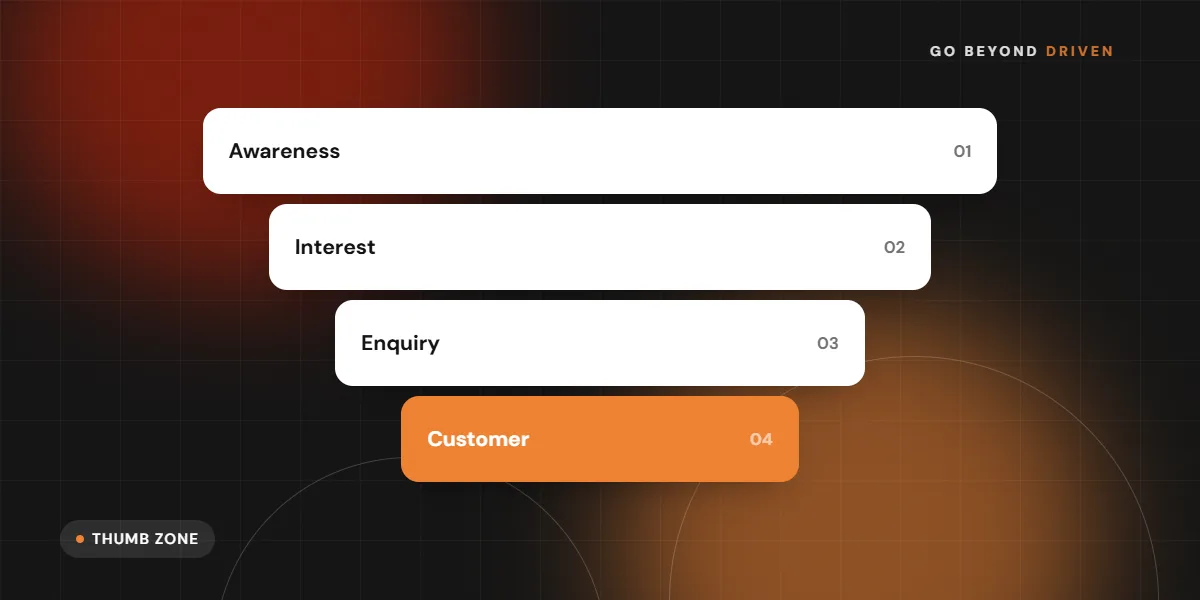
Most people hold a phone in one hand and use their thumb, so the easiest area to reach is the lower middle of the screen. Put the highest value actions there: a sticky call button, a WhatsApp button or a book now button. A simple menu with five or six clear labels beats a deep multi-level menu that needs precise tapping.
Keep the header slim so content starts quickly, and make sure the menu opens and closes smoothly with a visible close control. Add a search box only if you have enough pages to need it. Breadcrumbs, a back link on service pages and a clear logo link to the homepage help people recover when they tap the wrong thing.
Label menu items in the words customers use. Interior designers might say Residential and Commercial, while a clinic might say Book appointment and Our doctors. Clever names such as Solutions or Expertise force an extra tap just to learn what is inside, and on a phone every extra tap loses some visitors.
How big should buttons and text be on mobile?
As a working rule, interactive elements should be at least about 44 to 48 pixels tall and wide, with space between neighbouring links, so a thumb can hit the right one. Body text should usually be around 16 pixels or larger. Anything smaller forces pinching and zooming, which people rarely bother to do.
Check contrast too. A pale grey line of text may look elegant on a designer's bright monitor and disappear outdoors in Mumbai sunlight. Use dark text on a light background for long reading, and keep line lengths short enough that a paragraph never turns into a wall.
Support Hindi and Marathi where your customers do. Devanagari text needs a font that renders cleanly at small sizes and slightly more line spacing than Latin text. Test any bilingual page on an actual phone, because fallback fonts can make Indian scripts look broken or push buttons out of place.
How do you make mobile pages load fast?
Start with images, which are usually the heaviest part of a page. Serve properly sized images in modern formats such as WebP, lazy load those below the fold and never upload a full-size camera photo. Limit custom fonts to one or two weights, and remove scripts you do not need, including old chat widgets and unused tracking tags.
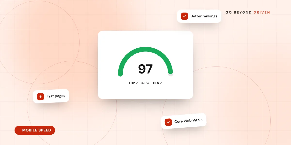
Test on a mid-range Android phone over mobile data rather than only on office Wi-Fi and a flagship phone. If you run ads, a slow mobile page wastes paid clicks. Read our guide on website speed and Core Web Vitals for the specific targets.
Reserve space for images and banners so the page does not jump while loading, which causes mis-taps on buttons. Defer anything below the first screen, such as maps, reviews widgets and video embeds, until the visitor scrolls near them. A map that loads only when needed saves a lot of data on a contact page.
How should forms, calls and WhatsApp work on mobile?
Reduce forms to the fields you truly need, often name, phone number and one short question. Use tel and email input types so the right keyboard appears, enable autofill, and show clear error messages next to the field that needs fixing. A click-to-call link and a WhatsApp link with a prefilled message are often more effective than a long form, because they match how Indian customers already prefer to talk.
Make sure those buttons stay visible without covering content. Test that the WhatsApp link opens correctly on both Android and iPhone, and that the thank-you page confirms what happens next. See our contact form design best practices for more detail.
FAQs: How should forms, calls and WhatsApp work on mobile?
Should I use a floating WhatsApp button?
Yes, if it does not block content or the main button. Keep it small, in the lower corner, and link it to a prefilled message so visitors know what to type.
Do popups hurt mobile pages?
Large popups that cover the screen right after load frustrate visitors and can create problems with search guidelines. If you use one, delay it and make the close button easy to tap.
How do you test whether your site is truly mobile friendly?
Open the site on at least two real phones, one Android and one iPhone, and try the actions a customer would: find a service, read a page, call, message and fill in a form. Watch someone else do it without any help, since you already know where everything is. Their hesitations show you the real problems.
Then use tools as a second check. Google's PageSpeed Insights and Lighthouse report mobile performance, and Search Console shows mobile usability and indexing problems for your live pages. Fix the biggest issues on your highest traffic and highest revenue pages first rather than polishing everything evenly.
Repeat the test after every redesign, plugin change or new campaign landing page. Mobile problems often appear after small edits, such as a new banner that pushes the call button below the fold or a chat widget that covers the footer links.
Quick mobile audit list:
Final thoughts
Mobile first web design is less about technology and more about respect for how your customers actually use their phones. Start with the content that matters, make the next step obvious and keep every page light. If you are unsure how your current site performs on a phone, request a free marketing audit from Go Beyond Driven, or explore our website design and development company services in Mumbai.