

Contact form design best practices come down to one idea: make it as easy as possible for a real person to tell you what they need. That means asking only for information you will use, labelling every field clearly, working smoothly on a phone, explaining what happens after submission and delivering the enquiry to someone who replies quickly. A form is often the last step before a lead becomes a customer, so small design choices affect revenue directly. This guide covers field selection, layout, labels, validation, spam control, mobile behaviour, the confirmation message and how to test what works for your business.
How many fields should a contact form have?
Use as few fields as you need to respond usefully. For most service businesses that is name, a phone number or email, and a short message or a single qualifying question. Every extra field adds effort and gives a visitor another reason to leave. If you cannot say how you will use a field, remove it.
There is an exception: if poor-fit enquiries waste your team's time, one or two qualifying fields can help, such as city, budget range or service needed. Make these dropdowns or radio buttons rather than free text. Collect the rest during the first call. Test a shorter version against your current form before assuming longer is better.
Think about the person filling it in as well. Someone asking about a wedding venue, a flat renovation or a clinic appointment may be on a break at work or on a train, with a few spare minutes. If the form feels like paperwork, they will close the tab and call a competitor instead. Respecting their time is the single biggest design rule.
A solid starting set of fields:
Should labels sit above fields or inside them?
Place visible labels above fields. Placeholder text inside a field disappears when someone starts typing, which makes it hard to check or correct what they entered, and it can be difficult for people with low vision or memory issues. Use placeholders only for brief examples, such as the format of a phone number.
Mark optional fields as optional rather than starring every required one, since most fields on a good form are required anyway. Use plain language: Your name, not Full legal name of enquirer. Keep one column on mobile and in most desktop layouts, because a single vertical flow is quicker to scan and complete than side-by-side fields.
What makes a contact form work well on mobile?
Most visitors in India reach business sites on phones, so design for thumbs first. Use large tap targets, enough spacing between fields and a submit button that spans the width of the screen. Set the right input types so the phone shows a numeric keypad for phone numbers and an email keyboard for email addresses.
Enable autofill with correct field names and autocomplete attributes, keep the form above the keyboard where possible and avoid captchas that require selecting tiny images. Test on a real mid-range Android phone over mobile data. Our guide to mobile first web design explains the wider principles behind these choices.
Keep the form short enough that it never needs scrolling on a small screen if you can help it. If the form must be longer, break it into labelled groups, show progress, and save what the visitor has typed in case they switch apps to check a detail. Phones are interrupted constantly, so forms that survive an interruption convert better.

How should validation and error messages work?
Validate as people complete the form, not only after they press submit, and place the message next to the field concerned. Say what went wrong and how to fix it: Please enter a 10 digit mobile number is better than Invalid input. Keep what the user has already typed, so a single error never wipes the form.
Do not use red colour alone to signal problems. Add an icon or text so colour-blind visitors can tell. Avoid being too strict: accept spaces, hyphens and the plus 91 prefix in phone numbers, and allow international addresses if you serve overseas clients. Accessible forms also tend to convert better, as covered in our website accessibility guide.
FAQs: How should validation and error messages work?
Should I use a captcha on my contact form?
Prefer invisible methods first, such as a honeypot field, time checks and server-side filtering. Use a visible captcha only if spam becomes a real problem, because it adds friction for genuine visitors.
Is a phone number field required?
Only if you plan to call. Many Indian customers prefer WhatsApp, so ask for a mobile number and say how you will use it. If email is enough, make phone optional.
Where should the contact form go on the page?
Put a form where the visitor is ready to act: on the contact page, at the end of service pages, and on landing pages near the main offer. For long pages, repeat a short version or a button that opens it. Hiding it in the footer on every page is rarely enough.
Place trust cues around it. A line such as we reply within one working day, a visible phone number, your office address and a privacy note give reassurance. Avoid distracting links around the form. If it sits on a landing page, remove the full menu so visitors focus on the single action you want them to take.
Heat maps and session recordings can show whether visitors scroll far enough to reach the form, hesitate on a particular field or abandon after an error. Even without special tools, you can compare views of the contact page with completed submissions in analytics. A large gap points to a form that needs simplifying rather than a traffic problem.
What should happen after someone submits?
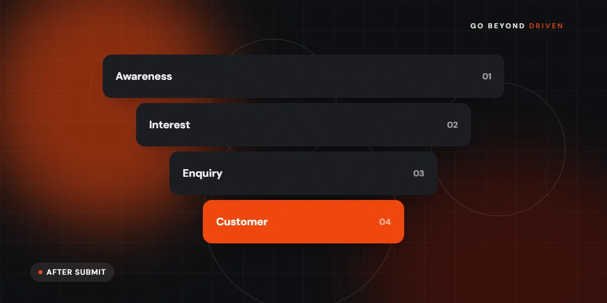
Show a clear confirmation, either on the same page or on a thank you page, stating that the message was received, when they can expect a reply and what to do if it is urgent. Send an automatic email or WhatsApp confirmation too. Without a confirmation, people wonder whether the form worked and often submit twice.
Route the enquiry to a person, not a dead inbox. Send it to email and a CRM or shared sheet, notify the right team member and reply quickly. Response speed has a large effect on whether a lead converts. A thank you page also lets you track conversions accurately in analytics and ad platforms. See our conversion tracking setup guide for how to measure it.
A good confirmation message includes:
How do you stop spam without hurting real enquiries?
Start with invisible defences: a hidden honeypot field that humans never fill, a minimum time check between page load and submission, rate limiting by IP and server-side validation. These stop most bots without bothering visitors. Add a visible challenge only when needed and test it on mobile.
Filter links and known spam phrases in the message field carefully, since genuine enquiries sometimes include links. Check your spam folder and the form's logs from time to time to ensure real messages are not being blocked. Always confirm that notification emails actually arrive, especially after changing hosting or email settings.
Review spam rules after launch, not just before. Bots change tactics, and a rule that blocked everything last year may now catch real enquiries. Keep a log of rejected submissions for a few weeks so you can spot false positives, and send test messages from different devices and email providers to confirm that genuine enquiries still arrive in the right inbox.
Should you use a contact form, WhatsApp or both?
Offer both when your audience uses both. A form works well for detailed requests, record keeping and visitors who prefer email. WhatsApp works well for quick questions, price checks and customers who want a conversation. Put them side by side and track each separately so you can see what your visitors prefer.
If you add a WhatsApp button, pre-fill a short message such as the page or service the person was viewing. Make sure someone monitors the number during stated hours. Our WhatsApp marketing services can help set up replies, catalogues and follow up flows.
Final thoughts
The best contact forms are short, clear, accessible and connected to a quick human reply. Review yours on a phone today, test one change at a time and track completions. If you would like experts to review your forms, landing pages and lead flow, book a free marketing audit with Go Beyond Driven, or explore our conversion rate optimisation services.