
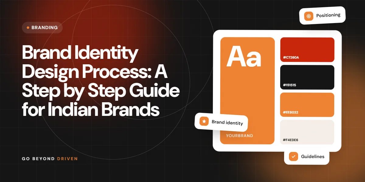
The brand identity design process is the sequence of steps that turns a business idea into a recognisable brand: research, strategy, naming and voice, logo, colours, typography, testing and a guidelines document your team can follow. Done properly, it usually takes 4 to 10 weeks for a small or mid-sized business and gives you one consistent look and message across your website, Instagram, packaging, signage and WhatsApp. This guide walks through each step in order, explains what you should receive at every stage, and covers timelines, typical costs in India and the mistakes that make brands look generic. If you are a founder in Mumbai planning a launch or a rebrand, use it as a checklist before you brief any designer.
What Is Brand Identity Design, and How Is It Different From a Logo?
Brand identity is the full set of signals people use to recognise you and decide what you stand for. The logo is one part of it. The rest includes your colour palette, typefaces, photography style, icons, layouts, tone of voice, tagline and even the way your team writes a WhatsApp reply. A logo on its own cannot carry a brand. A clothing label in Bandra and a CA firm in Fort may both have neat logos, yet only the one with a consistent system across every touchpoint will feel established when a customer meets it for the third or fourth time.
This matters commercially. Buyers in India compare options fast, often on a phone, often from a reel or a Google search result. A coherent identity makes you look credible in those first few seconds, which helps your ads, your website and your sales calls work harder. It also saves money later, because your team stops reinventing designs for every festive post, brochure or event standee, and new vendors can pick up the system without a long briefing.
A complete brand identity usually includes:
Step 1: Discovery and Research
Every good identity starts with listening. In the discovery stage, the designer or agency interviews founders and key team members, reviews sales data and customer feedback, and studies what the business has already built. Expect a questionnaire and a workshop of two to three hours. The goal is to understand why the business exists, who buys from it, what they value and what they currently misunderstand about you. A good team will also speak to a handful of actual customers, because founders often describe their brand differently from the people paying for it.
Research also covers the market. That means auditing 8 to 15 competitors, including the ones your customers actually consider, not just the big national names. Look at their logos, colours, websites, Instagram grids and pricing language. You will usually notice patterns, such as every clinic using blue and teal, or every interior studio using beige and serif type. Those patterns tell you where the category is crowded and where you have room to stand apart.
FAQs: Step 1: Discovery and Research
What should I prepare before a brand discovery workshop?
Bring your business plan, sales numbers by product or service, customer reviews, examples of brands you admire and dislike, and a clear list of who makes final decisions. This saves a full round of revisions later.
Do small businesses really need brand research?
Yes, though it can be lighter. Even a two week review of competitors and ten honest customer conversations will stop you from choosing a look that blends straight into your category.
Step 2: Brand Strategy and Positioning
Strategy is the bridge between research and design. Before anyone opens a design tool, you should agree on a short written strategy: your target audience, the problem you solve, your positioning statement, your brand personality and three or four messages you want people to remember. This document becomes the brief that every design decision is checked against. If a logo concept looks beautiful but feels playful when your strategy says precise and premium, it is the wrong concept, however much the team likes it.
Positioning deserves the most time here. It answers why a customer should choose you over the obvious alternatives, in one or two sentences. A Thane pharma distributor might position on reliability and same day delivery. A D2C snack brand might position on regional recipes made without palm oil. We cover this stage in more depth in our guide to brand positioning for startups. Strong positioning makes the visual work easier, because the designer knows exactly what feeling the identity must create.
Step 3: Verbal Identity: Name, Tagline and Tone of Voice
Many businesses skip straight to visuals, but words do half the work of an identity. If you are naming a new business or product, shortlist names that are easy to say in English and in the regional languages your customers speak, check domain and social handle availability, and run a trademark search on the official IP India database before you fall in love with any option. A name that sounds great in a boardroom can be hard to spell in a Google search or awkward when said aloud on a phone call.
Tone of voice defines how the brand speaks across ads, captions, emails and customer service. Write down three or four voice traits, each with a short do and do not. For example, warm but not casual, expert but not technical. Add sample lines for common moments: a product launch post, a delayed order apology, a WhatsApp welcome message. A tagline, if you need one, should come out of the positioning, not out of a brainstorm of clever phrases that sound good but say nothing.
Step 4: How Is a Logo Designed?
Logo design usually begins with sketching dozens of rough ideas, then narrowing to two or three directions that each interpret the strategy differently. One direction might be a wordmark built on custom lettering, another a symbol with a wordmark, a third a monogram. Each concept should be presented with a short rationale explaining how it connects to the positioning, not just as a pretty image on a white background. You should see every concept in black and white first, because a logo that only works in colour is fragile.
After you pick a direction, expect one or two rounds of refinement covering spacing, weight, proportions and small size legibility. The final logo suite should include a primary logo, a horizontal or stacked version, a compact icon for app tiles and social profile pictures, and versions for dark and light backgrounds. Ask for files in vector formats such as AI, EPS or SVG, plus PNGs for daily use. Without the source files, every future printer or web developer will struggle, and you will end up paying to recreate your own logo.
FAQs: Step 4: How Is a Logo Designed?
How many logo concepts should a designer show?
Two to three well developed concepts is a healthy number. More than five often means the designer has not committed to a strategic direction and is leaving you to do the thinking.
Should my logo include an icon or just text?
It depends on use. If you need a strong app icon, social avatar or product stamp, a symbol helps. Many service firms do perfectly well with a distinctive, well crafted wordmark.
Step 5: Colour Palette, Typography and Imagery
Colour is often the first thing people remember. A good palette has one or two primary colours that carry the brand, a few supporting colours, and neutrals for backgrounds and text. Each colour should be defined in HEX for screens, RGB, CMYK for print and ideally a Pantone reference for packaging. Check that text colours have enough contrast on your website, because a pale grey on white might look elegant on a designer's monitor but becomes unreadable on a budget Android phone in bright Mumbai sunlight.
Typography gives the brand its voice on screen and paper. Most identities need a heading typeface and a body typeface, and if you sell in Marathi, Hindi or Gujarati, a matching Devanagari or Gujarati font that sits comfortably beside the English one. Check licensing, because many fonts need a paid licence for commercial or web use. Finally, define an imagery style covering photography lighting, crop, people versus product, and rules for illustration and icons. This is what keeps your Instagram grid recognisable even without the logo.
Specify these for every brand colour:
Step 6: Test the Identity on Real Touchpoints
Before you sign off, the identity must be tested where customers will actually see it. Ask for mockups of your website homepage, an Instagram post and story, a business card, an email signature, a WhatsApp Business profile picture, packaging or signage if relevant, and a presentation slide. Seeing the logo at 40 pixels on a phone screen, or on a shop board on a busy Dadar street, reveals problems that a large artboard hides. This stage often triggers small but important fixes to weight, spacing and colour.
It also helps to put concepts in front of a few real customers or trusted partners. You are not asking them to vote on the logo, which tends to reward the safest option. You are checking whether the identity communicates the intended feeling: premium, friendly, technical or proudly local. If people describe it with the words in your strategy document, you are on track. If they say it looks like a competitor, go back a step now rather than after printing ten thousand brochures.
Step 7: Brand Guidelines and Rollout
Brand guidelines turn the design into a system your team and vendors can follow without calling the designer every week. A practical guideline document, often 20 to 40 pages for a small business, covers logo usage and clear space, incorrect uses, colour codes, typography hierarchy, imagery rules, tone of voice with examples, and ready templates. Templates matter a lot in India, where much of the day to day design is done by in-house executives or freelancers working in Canva. Give them editable social post, story, presentation and letterhead templates.
Rollout is where many identities fail. Plan it like a project: list every touchpoint, rank them by customer visibility, and update them in order. Usually that means website, Google Business Profile, social profiles and WhatsApp first, then sales collateral, then signage and packaging as old stock runs out. Your website design should be refreshed alongside the identity, because it is the place most prospects check before they enquire. Our post on brand website development elements explains what that refresh should include.
How Long Does the Brand Identity Design Process Take, and What Does It Cost in India?
For a small or mid-sized business, a full identity usually takes 4 to 10 weeks. Discovery and strategy take one to three weeks, design concepts two to three weeks, refinement and testing one to two weeks, and guidelines one to two weeks. The biggest delays almost always come from the client side: slow feedback, too many decision makers, or changing the brief after concepts are presented. Agree on one final decision maker and fixed feedback windows at the start, and the timeline usually holds.
Costs in India vary widely with scope and experience. A freelance logo alone can cost a few thousand rupees, while a complete identity with strategy, logo suite, palette, typography, guidelines and templates from an established studio typically starts around ₹75,000 to ₹1,50,000 and can go well beyond that for larger companies or packaging-heavy brands. Treat these as broad ranges, not quotes. The more useful question is what is included: strategy, number of concepts, revision rounds, source files, font licences and templates. Our article on why hire a brand agency explains when the investment makes sense.
Mistakes to Avoid in Brand Identity Design
The most common mistake is designing before agreeing on strategy, which leads to endless rounds of subjective feedback. The second is copying a category leader so closely that your brand becomes invisible. The third is choosing a look that suits the founder's personal taste rather than the customer's expectations. A fourth is ignoring practical use: a thin, detailed logo that disappears on a phone screen, on embroidery or on a delivery box. Finally, many businesses spend well on the logo and nothing on templates and guidelines, so consistency collapses within six months.
Use this short checklist before you approve your identity. Does it reflect the written positioning? Does it look clearly different from your top five competitors? Does the logo work in one colour and at very small sizes? Are colour codes and fonts documented and properly licensed? Do you own all source files? Do your team and freelancers have editable templates? Is there a rollout plan with dates and owners? If you can answer yes to each question, your identity is ready for launch.
Pre-approval checklist:
Final Thoughts
A strong brand identity is not a one time art project. It is a working system that makes every rupee you spend on ads, content and sales work harder, because customers recognise you faster and trust you sooner. Follow the brand identity design process in order: research, strategy, words, visuals, testing, guidelines and rollout. Doing so avoids most of the expensive rework that comes from jumping straight to a logo and fixing the thinking later. It also gives your team a shared reference point for every future campaign.
If you are planning a new brand or a rebrand, our branding team in Mumbai can help with strategy, identity design and rollout across your website and social channels. Not sure where your current brand is losing customers? Book a free marketing audit and we will review your brand, website and digital presence, then share clear, practical next steps you can act on straight away, whether you work with us or not.